
FAIRBANKS
WOLVES
FAIRBANKS
WOLVES
FAIRBANKS
WOLVES
HOCKEY TEAM CONCEPT
Fairbanks Wolves is a fictional hockey identity I created around the idea of building a team that felt like it belonged in Alaska. I wanted the brand to feel cold, aggressive, and modern while still having enough personality to work across jerseys, merchandise, social graphics, and the rink.

Primary Logo
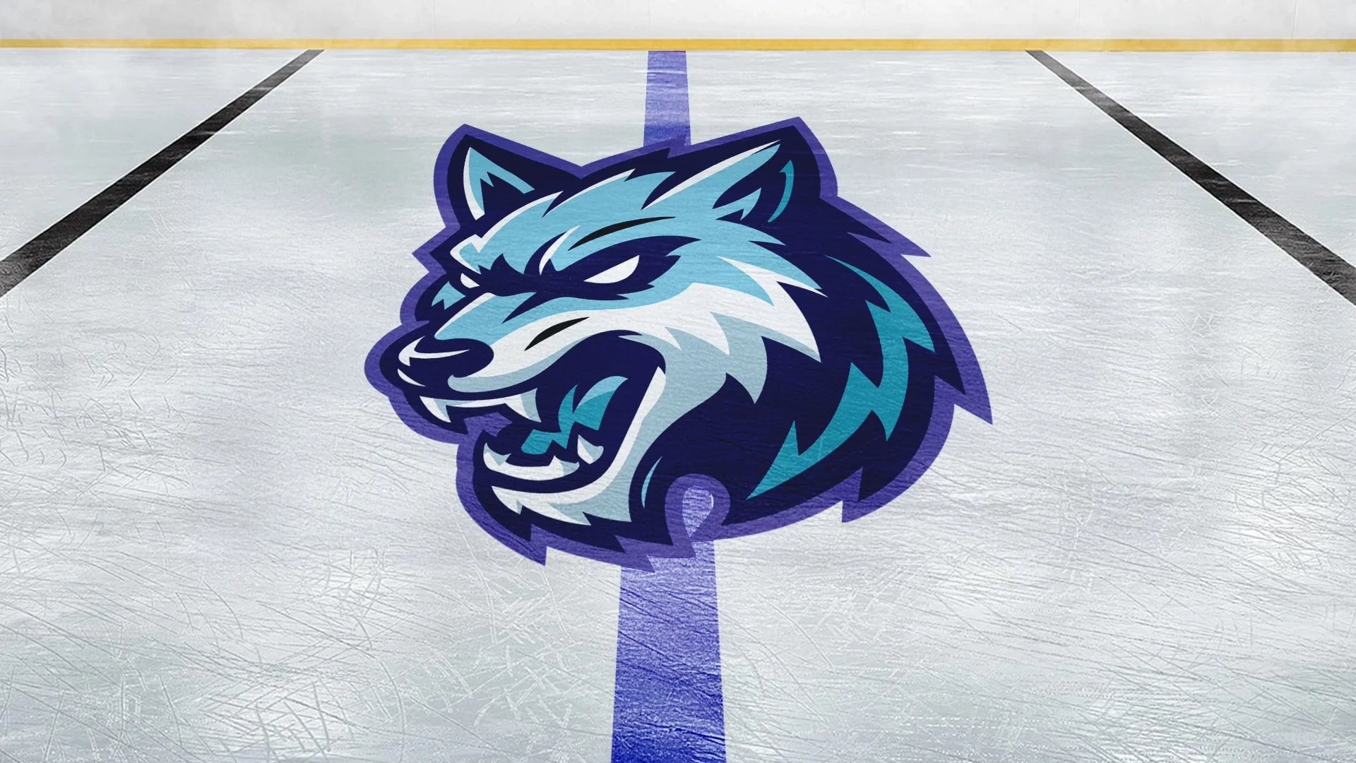
I wanted the wolf to feel aggressive without getting too complicated. I started with a strong silhouette and sharp shapes, then used the fur and facial details to give it some movement and attitude. The final mark was built to stay recognizable whether it’s full color on a jersey or simplified down to one color.
I wanted the wolf to feel aggressive without getting too complicated. I started with a strong silhouette and sharp shapes, then used the fur and facial details to give it some movement and attitude. The final mark was built to stay recognizable whether it’s full color on a jersey or simplified down to one color.

FULL COLOR

REVERSE

ONE COLOR
Secondary Identity
I built a few secondary marks so the identity had more to work with than just the primary wolf logo. Each one pulls from the same shapes, colors, and overall style, but gives the team another option depending on where the branding is being used.
I built a few secondary marks so the identity had more to work with than just the primary wolf logo. Each one pulls from the same shapes, colors, and overall style, but gives the team another option depending on where the branding is being used.

WORDMARK
The Fairbanks Wolves wordmark gives the team a clean type-driven option that works well across apparel, signage, and wider layouts.

W MARK
The standalone W brings the mountain shapes into the letter itself, tying the mark back to Alaska without needing the full team name or wolf.

FULL-BODY WOLF
The full-body wolf gives the identity a more illustrative option while keeping the same aggressive personality as the primary mark.
WORDMARK
The Fairbanks Wolves wordmark gives the team a clean type-driven option that works well across apparel, signage, and wider layouts.
W MARK
The standalone W brings the mountain shapes into the letter itself, tying the mark back to Alaska without needing the full team name or wolf.
FULL-BODY WOLF
The full-body wolf gives the identity a more illustrative option while keeping the same aggressive personality as the primary mark.
WORDMARK
The Fairbanks Wolves wordmark gives the team a clean type-driven option that works well across apparel, signage, and wider layouts.
W MARK
The standalone W brings the mountain shapes into the letter itself, tying the mark back to Alaska without needing the full team name or wolf.
FULL-BODY WOLF
The full-body wolf gives the identity a more illustrative option while keeping the same aggressive personality as the primary mark.
Color Palette
The palette pulls from the colder side of Alaska, mixing deep navy and violet with brighter icy blues. I wanted it to feel northern without leaning too heavily on the usual snow-and-ice look, while still giving the team enough contrast for uniforms, graphics, and merchandise.
The palette pulls from the colder side of Alaska, mixing deep navy and violet with brighter icy blues. I wanted it to feel northern without leaning too heavily on the usual snow-and-ice look, while still giving the team enough contrast for uniforms, graphics, and merchandise.
AURORA VIOLET
#51479B
MIDNIGHT
#161442
ICEFLOW
#81B0C9
DEEP ICE
#3095B1
AURORA VIOLET
#51479B
ICEFLOW
#81B0C9
MIDNIGHT
#161442
DEEP ICE
#3095B1
AURORA VIOLET
#51479B
MIDNIGHT
#161442
ICEFLOW
#81B0C9
DEEP ICE
#3095B1
BRINGING THE TEAM ONLINE
Social Media
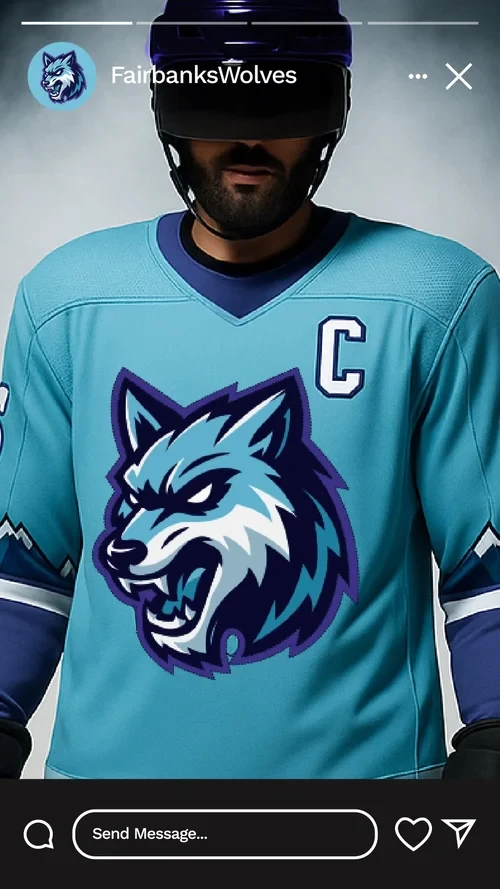
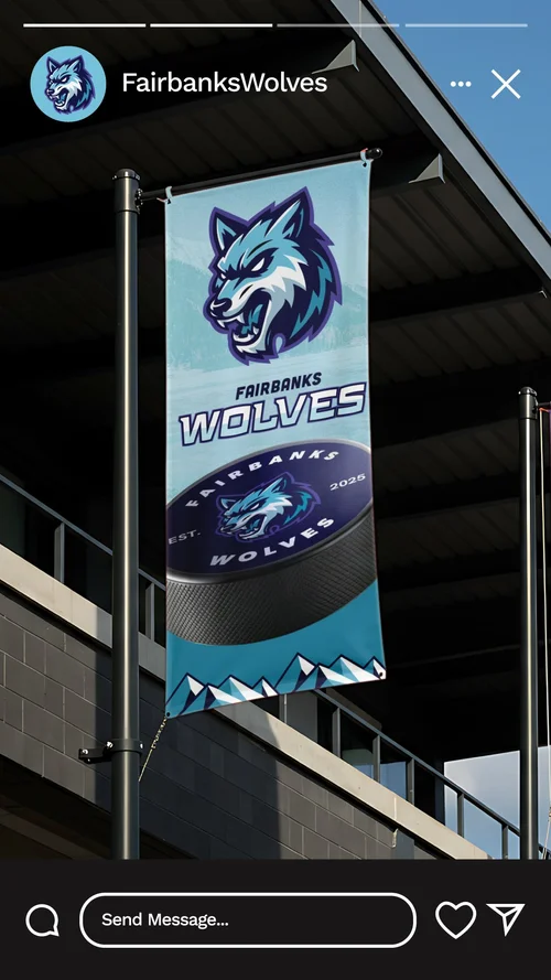
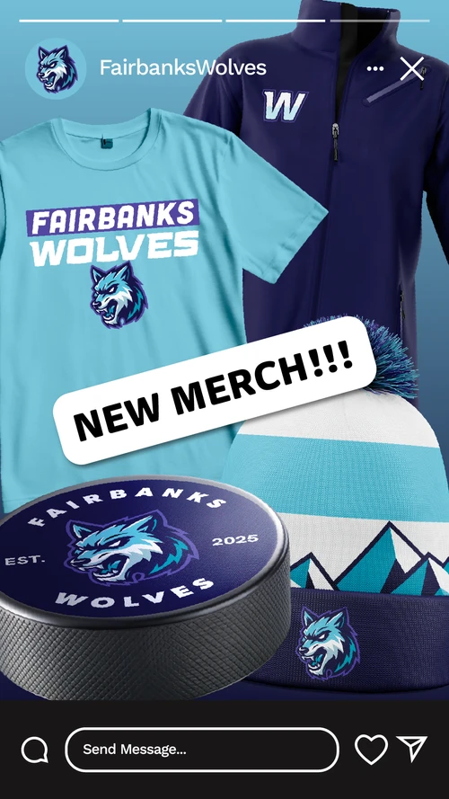
I mocked up a small set of social graphics to see how the identity could carry into game-day content, merchandise drops, and team announcements. This also gave me a chance to use the secondary marks, colors, and photography together instead of only showing the logo by itself.
I mocked up a small set of social graphics to see how the identity could carry into game-day content, merchandise drops, and team announcements. This also gave me a chance to use the secondary marks, colors, and photography together instead of only showing the logo by itself.

Mockups
More Than a Logo
I wanted the identity to feel believable outside of a logo sheet, so I applied it across apparel, equipment, merchandise, and other team pieces. Seeing the different marks working together helped turn Fairbanks Wolves from one logo into a full hockey identity.
I wanted the identity to feel believable outside of a logo sheet, so I applied it across apparel, equipment, merchandise, and other team pieces. Seeing the different marks working together helped turn Fairbanks Wolves from one logo into a full hockey identity.


