
BUFFALO
BISON
BUFFALO
BISON
FOOTBALL TEAM CONCEPT
Buffalo Bison is a fictional football identity I created from the ground up, starting with the team name and logo and expanding it into colors, uniforms, social graphics, merchandise, and the overall look of the team.

Primary Logo
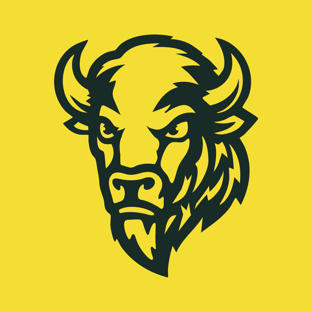
I wanted the primary mark to feel tough and recognizable without getting overly detailed. I built the bison around a strong front-facing shape, using the horns, heavy brow, and facial details to give it some attitude while keeping the silhouette easy to recognize.
From there, I tested it in full color and simplified versions to make sure the mark could still work across helmets, uniforms, merchandise, and smaller applications.
I wanted the primary mark to feel tough and recognizable without getting overly detailed. I built the bison around a strong front-facing shape, using the horns, heavy brow, and facial details to give it some attitude while keeping the silhouette easy to recognize.
From there, I tested it in full color and simplified versions to make sure the mark could still work across helmets, uniforms, merchandise, and smaller applications.

FULL COLOR

REVERSE
ONE COLOR
Secondary Identity
The primary bison works well as the main team mark, but I also wanted the identity to have options when the full mascot wasn't needed. I created supporting marks and typography that could carry the same look into uniforms, apparel, graphics, and wider layouts.
The primary bison works well as the main team mark, but I also wanted the identity to have options when the full mascot wasn't needed. I created supporting marks and typography that could carry the same look into uniforms, apparel, graphics, and wider layouts.

HORIZONTAL LOCKUP
Combining the bison with the team name gives the identity a wider option for signage, apparel, digital graphics, and other places where the primary mark alone doesn't give enough context.

WORDMARK
The wordmark gives Buffalo Bison a type-driven option that can work on its own or alongside the primary mascot without competing with it.
HORIZONTAL LOCKUP
Combining the bison with the team name gives the identity a wider option for signage, apparel, digital graphics, and other places where the primary mark alone doesn't give enough context.
WORDMARK
The wordmark gives Buffalo Bison a type-driven option that can work on its own or alongside the primary mascot without competing with it.
HORIZONTAL LOCKUP
Combining the bison with the team name gives the identity a wider option for signage, apparel, digital graphics, and other places where the primary mark alone doesn't give enough context.
WORDMARK
The wordmark gives Buffalo Bison a type-driven option that can work on its own or alongside the primary mascot without competing with it.

Color Palette
The old traceability tool worked, but it looked like an afterthought. This version uses the brand's real color palette and small moments of motion to make tracking a product's origin feel like part of the experience, not a chore bolted onto the site.
The old traceability tool worked, but it looked like an afterthought. This version uses the brand's real color palette and small moments of motion to make tracking a product's origin feel like part of the experience, not a chore bolted onto the site.
STAMPEDE GOLD
#FFE000
GRASSLAND GREEN
#5FA79B
TIMBERLAND
#3B6861
DEEP RANGE
#192B27
STAMPEDE GOLD
#FFE000
GRASSLAND GREEN
#5FA79B
TIMBERLAND
#3B6861
DEEP RANGE
#192B27
STAMPEDE GOLD
#FFE000
TIMBERLAND
#3B6861
GRASSLAND GREEN
#5FA79B
DEEP RANGE
#192B27
GAME DAY CONTENT
Social Media
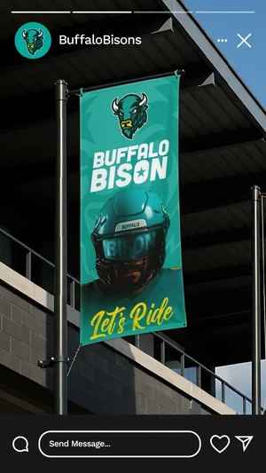
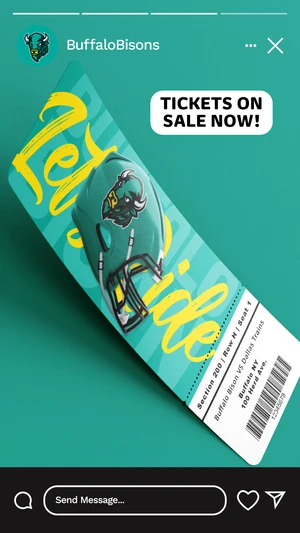
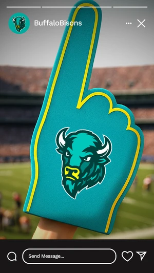
I created a small set of social graphics to see how the identity could work beyond the field. The posts mix player imagery, tickets, merchandise, and team branding while using the same colors and visual style established throughout the rest of the project.
I created a small set of social graphics to see how the identity could work beyond the field. The posts mix player imagery, tickets, merchandise, and team branding while using the same colors and visual style established throughout the rest of the project.

ON THE FIELD
Building the Uniforms
Once the identity and colors were set, I carried them into the uniforms to see how everything would work together on the field. I kept the jerseys fairly simple and used the yellow as an accent so the bison identity and team colors stayed the main focus.
Once the identity and colors were set, I carried them into the uniforms to see how everything would work together on the field. I kept the jerseys fairly simple and used the yellow as an accent so the bison identity and team colors stayed the main focus.


