Creative professional in a dark studio

BAD MULE ENERGY

BAD MULE
ENERGY

BRAND IDENTITY · PACKAGING · CONCEPT

A fictional energy drink brand built from the ground up around a stubborn mascot, loud personality, and packaging made to stand out.

THE BRAND BEHIND THE KICK

THE BRAND BEHIND THE KICK

Bad Mule Energy started as the parent brand for the whole idea. I wanted to create something with enough personality to grow into different products without tying the identity to one specific drink or flavor.

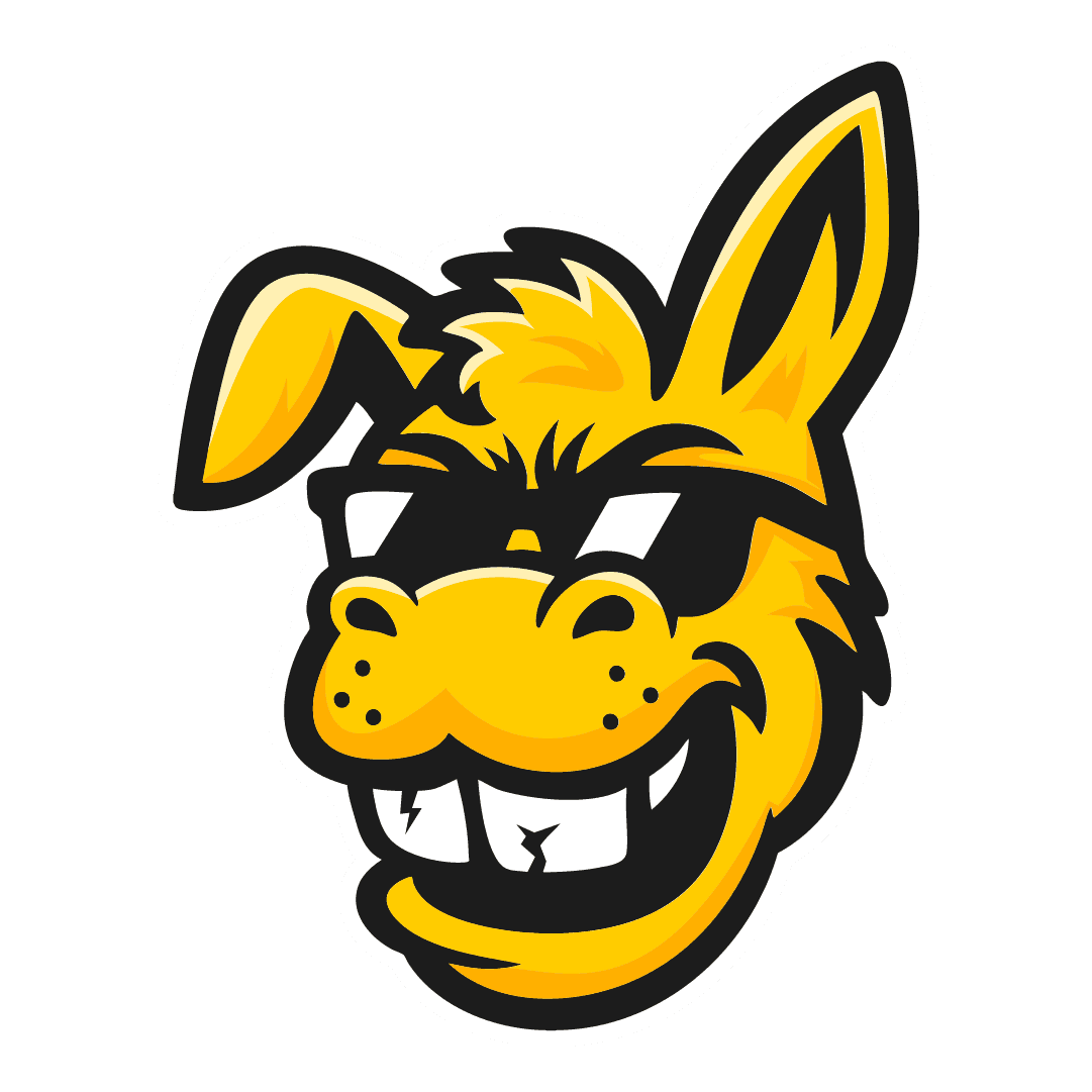
The mule became the center of that system, stubborn, loud, a little reckless, and easy to recognize wherever the brand shows up.

BUILT TO FLEX

Logo System

I built the Bad Mule identity so it could work at different sizes and in different situations. The full logo acts as the main brand mark, while the mule mascot and standalone wordmark give me simpler options when the full lockup isn’t needed.

I built the Bad Mule identity so it could work at different sizes and in different situations. The full logo acts as the main brand mark, while the mule mascot and standalone wordmark give me simpler options when the full lockup isn’t needed.

Primary Logo

MASCOT

WORD MARK

Color Palette

The Bad Mule palette stays intentionally simple. Yellow and orange bring the energy and personality, while black and white keep the identity bold and easy to use.

Keeping the parent brand limited also gives each product line and flavor room to introduce its own colors without losing the Bad Mule look.

The Bad Mule palette stays intentionally simple. Yellow and orange bring the energy and personality, while black and white keep the identity bold and easy to use.

Keeping the parent brand limited also gives each product line and flavor room to introduce its own colors without losing the Bad Mule look.

Kick Yellow

#FFCC00

Mule Gold

#FFB103

#FFB103

Clean White

#FFFFFF

Bad Black

#1D1D1D

Kick Yellow

#FFCC00

Clean White

#FFFFFF

Mule Gold

#FFB103

#FFB103

Bad Black

#1D1D1D

Kick Yellow

#FFCC00

Mule Gold

#FFB103

#FFB103

Clean White

#FFFFFF

Bad Black

#1D1D1D

MEET MULE FUEL

Mule Fuel is the first product line under Bad Mule Energy. This is where I could take the attitude of the parent brand and push it into something louder, faster, and more product-focused.

The packaging uses oversized type, heavy contrast, and the lightning bolt running through the Mule Fuel name to give the drink its own identity while still clearly living under Bad Mule.

TAKING IT FURTHER

Beyond the Can

Once the can was finished, I wanted to see how Blueberry Lemonade could live beyond the package itself. I built out a promotional poster, case packaging, and a quick T-shirt concept that could work as branded merch or a giveaway.

Each piece uses the same blue, yellow, oversized type, and “Unleash Your Inner Mule” message so the flavor feels like its own small campaign instead of a single can design.

Once the can was finished, I wanted to see how Blueberry Lemonade could live beyond the package itself. I built out a promotional poster, case packaging, and a quick T-shirt concept that could work as branded merch or a giveaway.

Each piece uses the same blue, yellow, oversized type, and “Unleash Your Inner Mule” message so the flavor feels like its own small campaign instead of a single can design.