Creative professional in a dark studio

SELECTED EXTRAS

Not every project needs a full case study. This is a collection of shirts, posters, sports graphics, album artwork, and other one-off projects I’ve worked on along the way.

Some were made for clients, some were personal projects, and some were just ideas I wanted to see brought to life.

Shirt Designs
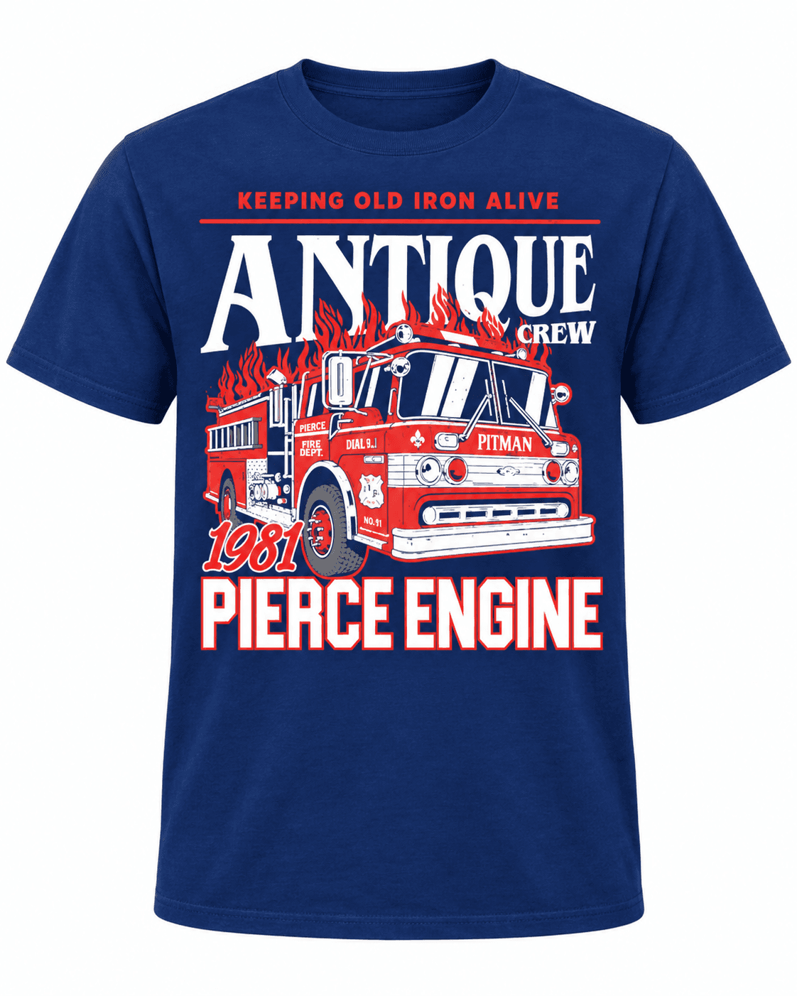
A mix of shirt graphics created for different projects, clients, and ideas. Apparel gives me a chance to push illustration and typography a little further and create something that still works when it’s stripped down to one graphic on a shirt.

A mix of shirt graphics created for different projects, clients, and ideas. Apparel gives me a chance to push illustration and typography a little further and create something that still works when it’s stripped down to one graphic on a shirt.

Recent Poster Designs

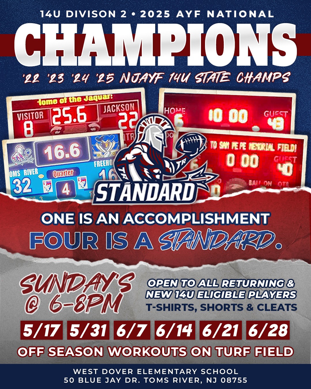
Posters are one of my favorite places to experiment because there’s usually more room to play with type, imagery, texture, and layout. These are a mix of promotional pieces, sports graphics, event posters, and other designs that didn’t need a full project page of their own.

Posters are one of my favorite places to experiment because there’s usually more room to play with type, imagery, texture, and layout. These are a mix of promotional pieces, sports graphics, event posters, and other designs that didn’t need a full project page of their own.

STRANGE TIMES

Album Artwork

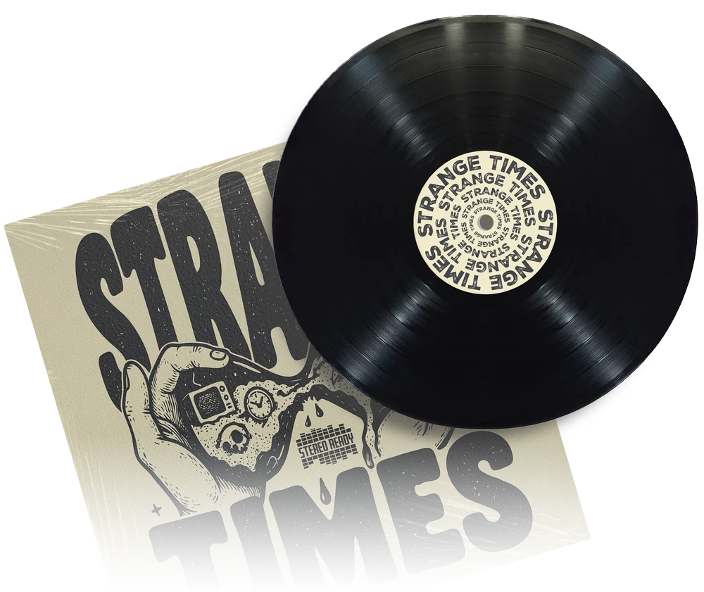
I created the album artwork for Stereo Ready’s Strange Times, building the look around the uneasy feeling behind the album. The hand-drawn illustration, distressed type, muted colors, and rough textures were meant to give it an old underground zine feel.

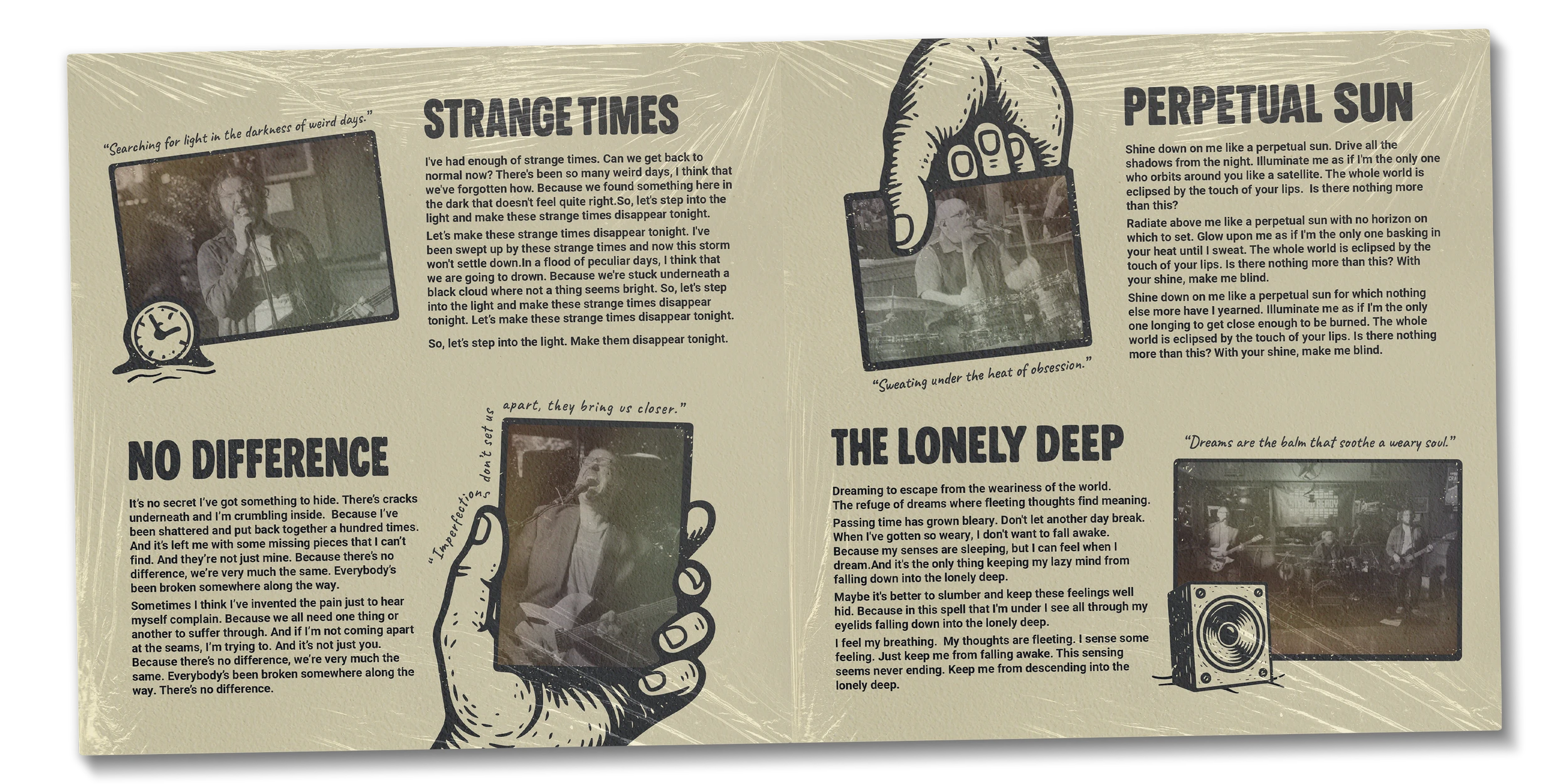
I carried the same style across the front cover, back cover, and interior artwork so the full record felt like one complete piece instead of just a standalone cover.

I created the album artwork for Stereo Ready’s Strange Times, building the look around the uneasy feeling behind the album. The hand-drawn illustration, distressed type, muted colors, and rough textures were meant to give it an old underground zine feel.

I carried the same style across the front cover, back cover, and interior artwork so the full record felt like one complete piece instead of just a standalone cover.