
ITALIAN
FOOD BRAND
ITALIAN
FOOD BRAND
ITALIAN
FOOD BRAND
WEB DESIGN + DEVELOPMENT · PRINT · DIGITAL
Over several years, my work with a specialty Italian food brand has grown from a complete website redesign into digital campaigns, advertising, print, and professional sports partnership work.
What started with rebuilding the website became a much bigger body of work and gave me the chance to help shape how the brand shows up across a lot of different places.
PROJECT OVERVIEW
The website became one of the biggest projects I’ve worked on. I redesigned and rebuilt more than 100 pages, working through the site piece by piece to figure out what should stay, what needed to change, and what could work better.
Over time, my work with the brand expanded far beyond the website. I’ve also created advertising, article graphics, digital campaigns, print pieces, event materials, and professional sports partnership work, all while keeping everything connected to the same visual system.
The website became one of the biggest projects I’ve worked on. I redesigned and rebuilt more than 100 pages, working through the site piece by piece to figure out what should stay, what needed to change, and what could work better.
Over time, my work with the brand expanded far beyond the website. I’ve also created advertising, article graphics, digital campaigns, print pieces, event materials, and professional sports partnership work, all while keeping everything connected to the same visual system.
Website Redesign
Old Site to New Experience
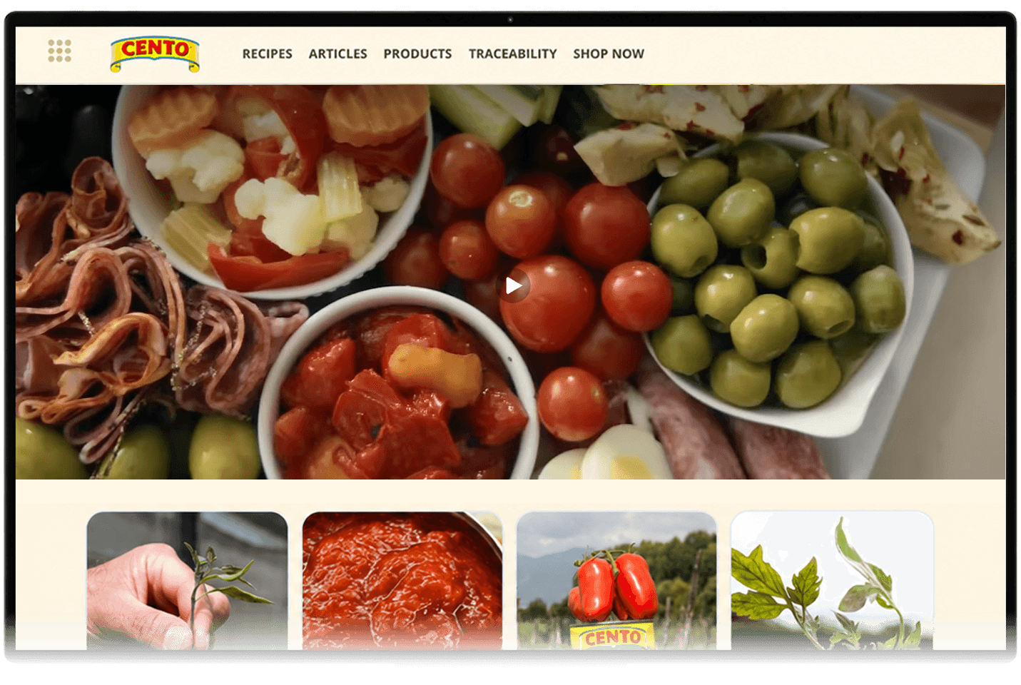
The old website had a lot of good information, products, and recipes, but finding any of it took more work than it should have.
I wanted the redesign to feel cleaner without losing the personality of the brand. I reorganized the navigation, simplified page layouts, updated the visual system, and rebuilt the experience around how someone would actually use the site instead of just how the old content happened to be organized.
The old website had a lot of good information, products, and recipes, but finding any of it took more work than it should have.
I wanted the redesign to feel cleaner without losing the personality of the brand. I reorganized the navigation, simplified page layouts, updated the visual system, and rebuilt the experience around how someone would actually use the site instead of just how the old content happened to be organized.
OLD
OLD
OLD

NEW
NEW
NEW
REBUILT, PAGE BY PAGE
I didn’t want to just reskin the old website and call it finished. I went through it page by page and looked at what each section was actually supposed to do.
Could someone find a product quickly? Could they narrow down hundreds of recipes? Did the information make sense on a phone? Was there an obvious next step?
Those questions drove most of the redesign. Some pages only needed cleanup. Others were completely reconsidered and rebuilt from scratch.
I didn’t want to just reskin the old website and call it finished. I went through it page by page and looked at what each section was actually supposed to do.
Could someone find a product quickly? Could they narrow down hundreds of recipes? Did the information make sense on a phone? Was there an obvious next step?
Those questions drove most of the redesign. Some pages only needed cleanup. Others were completely reconsidered and rebuilt from scratch.

Recipes
Recipes Got a Facelift
The old recipe browser was a wall of thumbnails with no way to narrow anything down. The new one filters by ingredient, meal type, and prep time, so someone with fifteen minutes and half a fridge can actually find something to cook.
The old recipe browser was a wall of thumbnails with no way to narrow anything down. The new one filters by ingredient, meal type, and prep time, so someone with fifteen minutes and half a fridge can actually find something to cook.
Articles
Rebuilding the Article Library
Over fifty articles had built up on the old site, many with layouts that felt dated and were difficult to read on a phone. I rebuilt each one around a consistent structure, clearer hierarchy, and imagery that actually supports the content.
Over fifty articles had built up on the old site, many with layouts that felt dated and were difficult to read on a phone. I rebuilt each one around a consistent structure, clearer hierarchy, and imagery that actually supports the content.

BUILDING A VISUAL SYSTEM
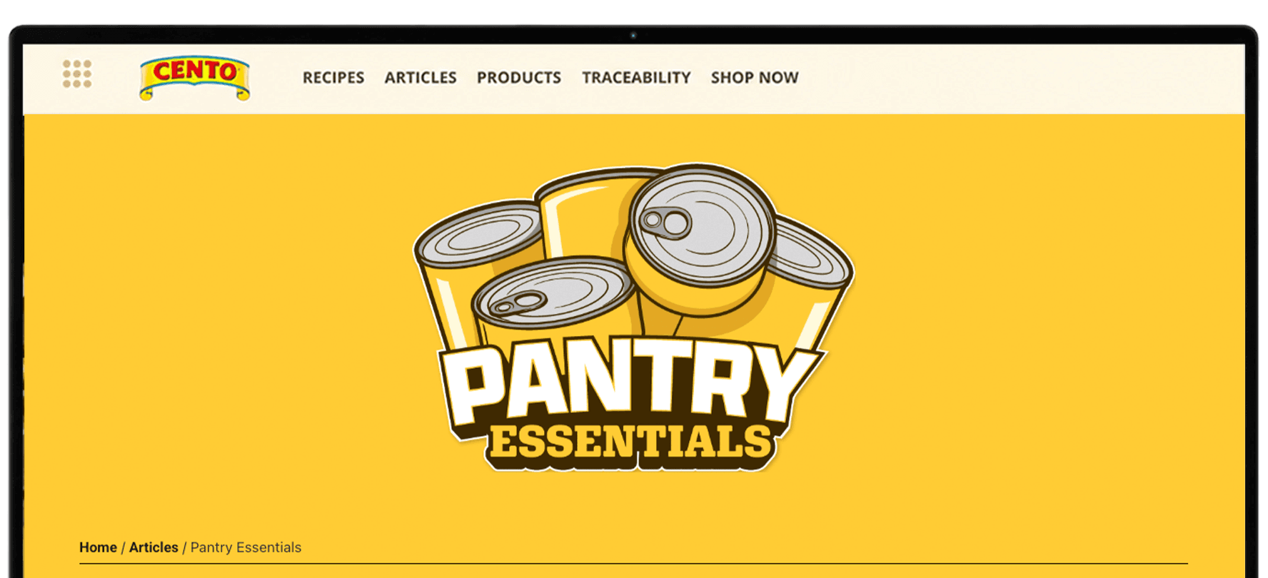
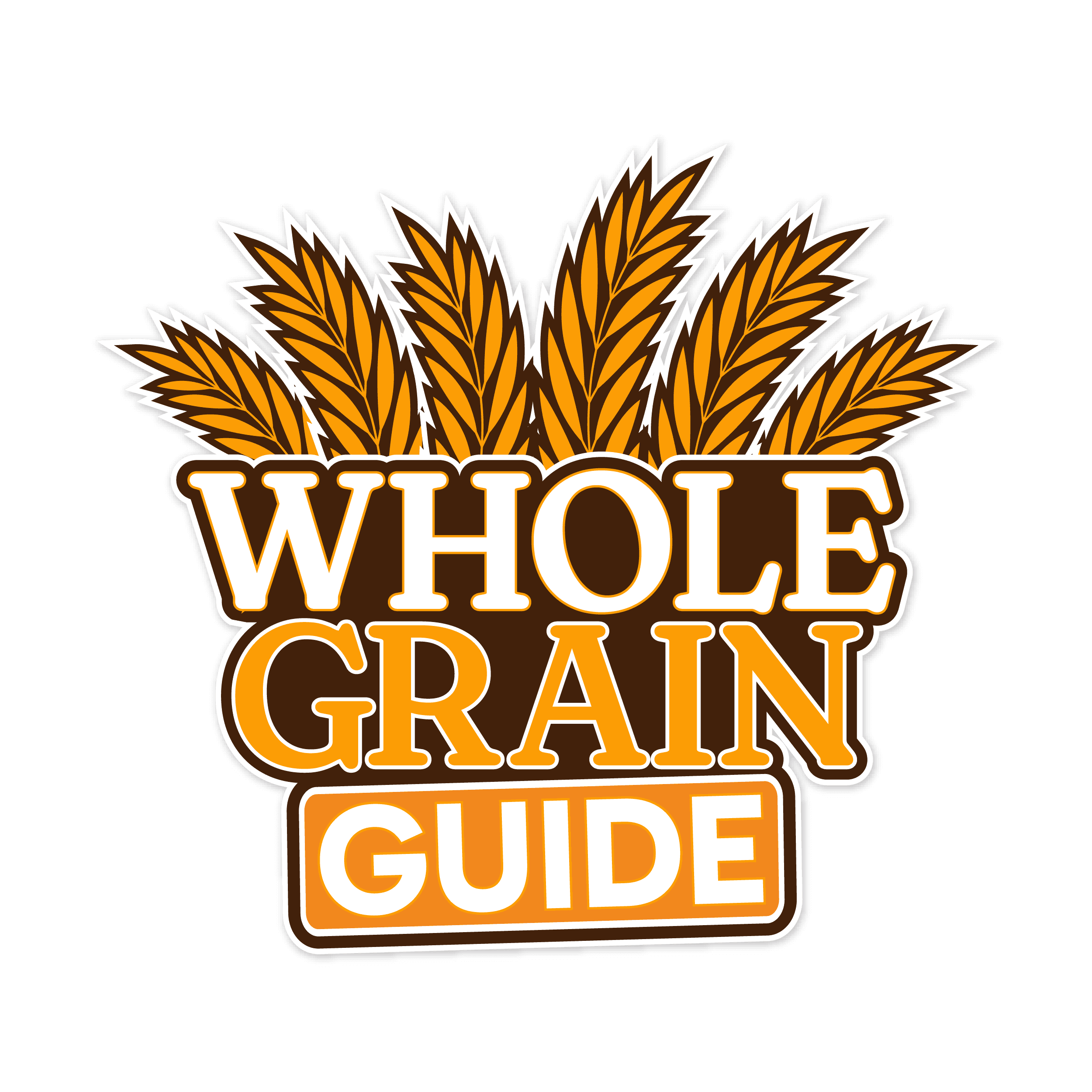
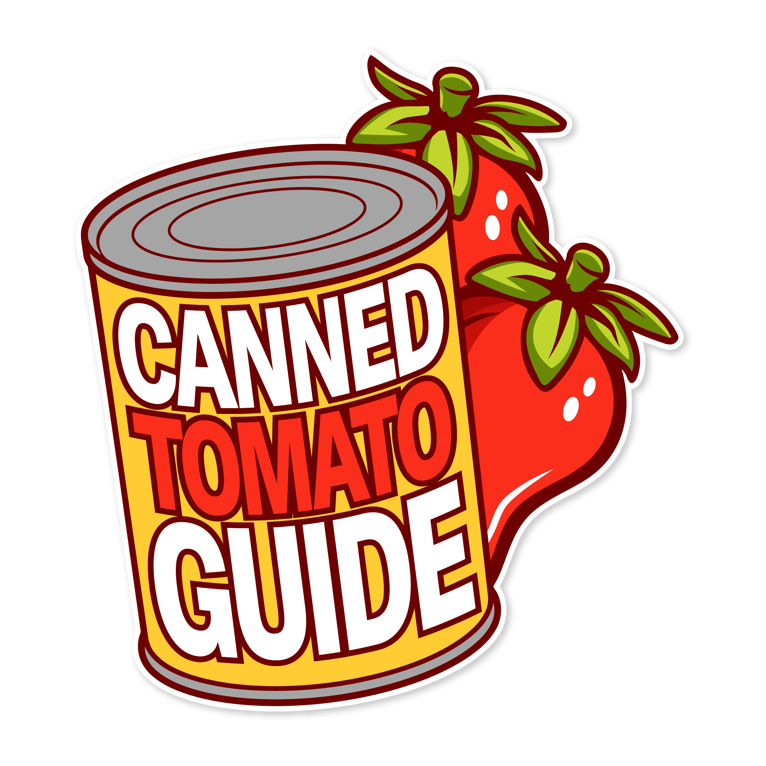
Article Badges
A full set of badges for the article library, redesigned to be more distinct at a glance so readers can tell what kind of article they're looking at before they click in.
A full set of badges for the article library, redesigned to be more distinct at a glance so readers can tell what kind of article they're looking at before they click in.





Traceability Features
Rethinking Traceability
The old traceability tool worked, but it looked like an afterthought. This version uses the brand's real color palette and small moments of motion to make tracking a product's origin feel like part of the experience, not a chore bolted onto the site.
The old traceability tool worked, but it looked like an afterthought. This version uses the brand's real color palette and small moments of motion to make tracking a product's origin feel like part of the experience, not a chore bolted onto the site.


BEYOND THE WEBSITE
The website is only one part of the work I’ve done with the brand.
Over time, I’ve carried the same visual thinking into advertising, social content, print, campaigns, event materials, and partnership work. Working across so many different pieces has given me the chance to see how one brand needs to stay consistent while still adapting to completely different formats.
That’s one of my favorite parts of working with the same brand over time. Each new project builds on what came before it instead of starting from scratch.
I didn’t want to just reskin the old website and call it finished. I went through it page by page and looked at what each section was actually supposed to do.
Could someone find a product quickly? Could they narrow down hundreds of recipes? Did the information make sense on a phone? Was there an obvious next step?
Those questions drove most of the redesign. Some pages only needed cleanup. Others were completely reconsidered and rebuilt from scratch.
PRINT DESIGN
Advertisment Designs
Advertising is another ongoing part of my work with the brand. I design product focused ads for both print and digital placements, usually working within an established campaign while finding ways to give each product its own moment. That can mean working around photography, packaging, certifications, product messaging, headlines, and a lot of required information without letting the final piece feel crowded. Over time, those ads have become another piece of the larger visual system I’ve helped build across the brand.
Advertising is another ongoing part of my work with the brand. I design product focused ads for both print and digital placements, usually working within an established campaign while finding ways to give each product its own moment. That can mean working around photography, packaging, certifications, product messaging, headlines, and a lot of required information without letting the final piece feel crowded. Over time, those ads have become another piece of the larger visual system I’ve helped build across the brand.




PHILADELPHIA UNION
Partnership Work
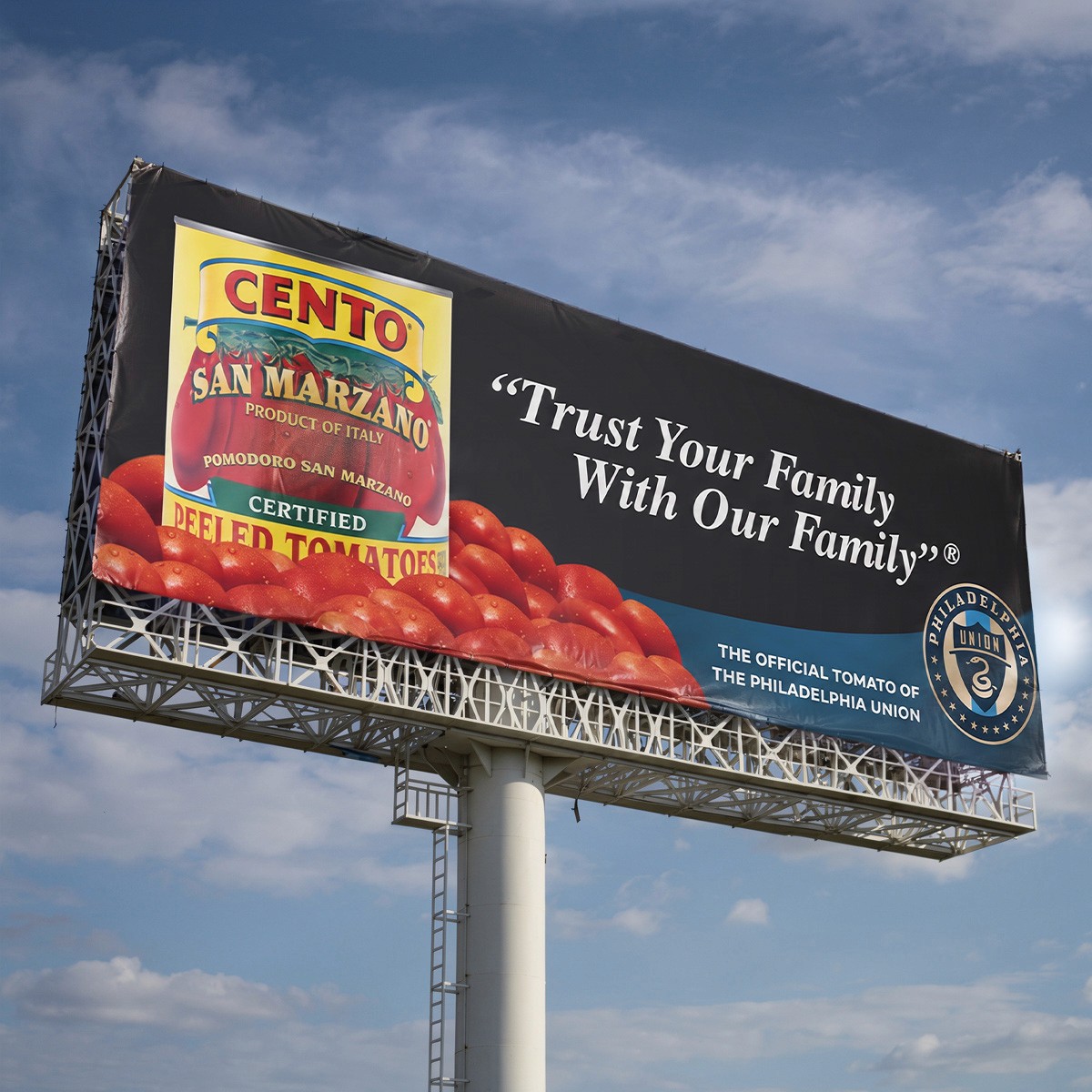
One of my favorite extensions of the work has been creating pieces for the brand's partnership with the Philadelphia Union.
I’ve designed stadium LED graphics, billboards, tunnel signage, youth complex materials, digital graphics, and other pieces that take an Italian food brand and make it work inside a professional sports environment.
The challenge is finding the balance between both brands. It still needs to feel connected to the food brand, but it also has to belong inside the Union's world and make an impact at a completely different scale.
One of my favorite extensions of the work has been creating pieces for the brand's partnership with the Philadelphia Union.
I’ve designed stadium LED graphics, billboards, tunnel signage, youth complex materials, digital graphics, and other pieces that take an Italian food brand and make it work inside a professional sports environment.
The challenge is finding the balance between both brands. It still needs to feel connected to the food brand, but it also has to belong inside the Union's world and make an impact at a completely different scale.

STADIUM LED · TUNNEL BANNER · BILLBOARDS · YOUTH COMPLEX MATERIALS · PARTNERSHIP GRAPHICS · FIND MY FIELD PIECES
STADIUM LED · TUNNEL BANNER · BILLBOARDS
YOUTH COMPLEX MATERIALS · PARTNERSHIP GRAPHICS